-
Anoka-Hennepin Schools Brand Guidelines
-
At the heart of Anoka-Hennepin Schools’ identity is the logo and tagline, “A future without limit.” The tagline is reflective of its schools, and also the staff, students, families and the community the district serves.
Brand Guidelines are designed to define the Anoka-Hennepin School District brand and help bring it to life through various communication outlets.
This book is a resource for website, e-newsletter and social media contacts on how to carry out their various communication tasks and stay “on-brand” with district messages and design.
Consistent use of these guidelines will bring a unified Anoka-Hennepin identity to both internal and external stakeholders, helping the district achieve its goal of preparing students for life.
Contact the Communication and Public Relations department if you have questions or comments about this book at comm.pr@ahschools.us. General questions, comments or news tips can be directed to news@ahschools.us.
Skip to Section:
Logos | Tagline | Messaging | Language | Typography | Colors | Accessibility | Photography | Patterns & Icons | Moodboard | Schools
-
The current Anoka-Hennepin Schools logo has been in place since 2006. It is the primary visual element to identify the school district. We want our stakeholders to identify with the positive experiences and encounters they have with our staff, schools and programs each day. Consistency in design and imagery is a key factor in helping our stakeholders associate those positive experiences with the school district.
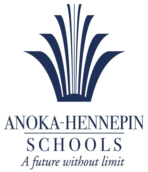
The district logo consists of three core elements, which have been specially designed and created in proportion to one another:
- The logotype - an open “book” icon that grows up and outward. The initial idea was that the district is an “open book” when it comes to accountabilty.
- The identifying words “Anoka-Hennepin Schools.”
- The tagline includes the phrase, “A future without limit.”
-
Logo Variations
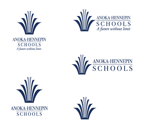
The Anoka-Hennepin Schools logo is versatile and available in horizontal and vertical formats, allowing for design flexibility.
-
Logo Usage
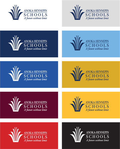
The approved logo color is Anoka-Hennepin navy (see page 21 for color codes and more). There is also a white/reversed version.
The examples on the right show the approved color combinations. The logo can be placed on a variety of background colors within the approved color palette, offering considerable flexibility for print and digital applications.
-
Clear Space
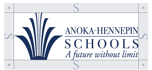
For maximum legibility, maintain clear space around the logo to avoid conflicts with other design elements. The minimum clear space is defined as the height of the “S” in Schools. This space should be maintained as the logo is proportionally resized.
-
Minimum Size
The Anoka-Hennepin Public School District logo should never appear smaller than the examples shown. You’re communicating with the intended impact and legibility by ensuring the logo is always these sizes or larger.

-
Logo Misuse
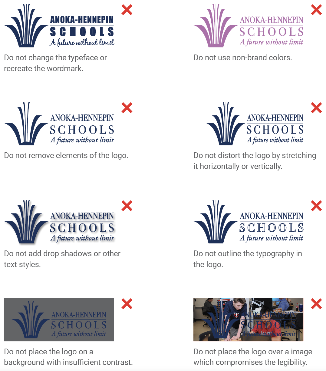
Distorting the logo’s shape or altering its typographic appearance creates confusion and dilutes the brand identity of Anoka-Hennepin School District.
- Do not change the typeface or recreate the wordmark.
- Do not use non-brand colors.
- Do not remove elements of the logo.
- Do not distort the logo by stretching it horizontally or vertically.
- Do not add drop shadows or other text styles.
- Do not outline the typography in the logo.
- Do not place the logo on a background with insufficient contrast.
- Do not place the logo over a image which compromises the legibility.
Shown here are examples that violate brand standards and are not acceptable.
-
Primary Tagline
The district tagline applies to schools, staff, students, their families and the community members each school serves. The tagline serves as inspiration that there is no limit to what they can achieve and what their future holds.

Secondary Tagline
One of the greatest impacts of Anoka-Hennepin Schools is the interactions that staff have with students and their families; and creating an educational experience that will carry its students throughout their lives.
It is the primary mission of the Anoka-Hennepin School District to educate each of our students for success. And students’ goals and dreams for the future are vastly diverse. Whether preparing students with essential academic skills or instilling the district’s core values (respect, responsibility, appreciation of diversity, integrity and compassion) in the educational experience. Students will leave the district ready to pursue whatever is next for them in life.

-
Consistency with the messages shared with the public are a big part of building a strong brand. Whether it’s a blog post, an advertisement, or even just an update on Facebook – we are communicating our brand. When those messages are positive, consistent and supportive, it is in alignment with building our brand as an outstanding school district where students have a future without limit.
Sending conflicting messages can confuse our stakeholders and actually negate the time and resources that we’ve already put into building our brand.
Values
- Respect
- Responsibility
- Appreciation of Diveristy
- Integrity
- Compassion
Personality
- Accountable
- Compassionate
- Intelligent
- Honest
- Innovative
- Fair
- Respectful
- Proud
- Successful
- Trustworthy
- Dedicated
- Responsive
- High-achieving
- Diverse
- Sensitive
- Friendly
- Collaborative
- Helpful
- Traditional
- Caring
Mission
Our primary mission is to effectively educate each of our students for success.
Vision
The vision of the district is to be a public school system of excellence, with high quality staff and programs and successful graduates.
-
Writing style and usage
The school district will follow the Associated Press (AP) style when writing and proofing content for brochures, websites, news releases, handbook and guidebook and other official documents.
AP style is standardly used in newspapers, magazines, news websites, and more. The AP styleguide is published and updated annually to reflect changes in writing style and new guidelines. The styleguide is organized by subjects/topics versus alphabetical order
(like a dictionary). -
Abbreviations and acronyms
Spell out acronyms on first reference. Use the acronym after referencing it in parenthesis only after the full title is spelled out.
Spell out acronyms on first reference.
- Blaine High School (BHS) is located at 12555 University Ave. NE, Blaine. The BHS mascot is a bengal.
-
Postal addresses
Use the abbreviations when listing a mailing address on an envelope, for example. All abbreviations should be followed by a period unless abbreviating a state. For example, NW.
Use the abbreviations when listing a mailing address on an envelope
- Anoka-Hennepin Schools Educational Service Center 2727 N. Ferry St.Anoka, MN 55303
In every use except addresses, spell out street names.
- The school is on Ferry Street.
When referencing a state in a sentence, spell it out or use the AP-style approved state abbreviation.
- Anoka, Minn.
- The Minnesota Department of Education.
-
Web addresses
Web addresses should be listed using all lowercase letters. For example, use: www.discovercommunityed.com
-
Email addresses
Email addresses should be listed using all lowercase letters. For example, use: firstname.lastname@ahschools.us
-
QR codes
Consider the audience and format when using a QR code. Some people are not ready or may not have the tools to use them. When possible, use a shortcut URL in place of a QR code for efficient use of space. QR codes should be reserved for print materials; codes cannot be scanned by a smart device when it is in use. Limit to one code per document, allow for white space around and behind it.
-
Email signatures
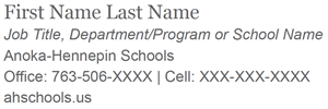
An email signature is an opportunity for recipients to find where to contact you for more information and to learn more about the school and/or the district that you are representing. Any details other than your contact information should serve as a marketing tool for your school or the school district.
In businesses and organizations, streamlined and consistent email signatures present your school and district in a professional format. Email signatures also verifies that the email they are receiving is from a legitimate or official school/district employee.
-
Ages
Numbers one through nine should be spelled out. Numbers higher than 10 should be referenced by numeric digits.
Numbers one through nine should be spelled out.
- Classes are for children ages three through five.
- Children ages 10 and up may participate in the field trip.
-
College and professional degrees
Spell out bachelor’s, master’s or doctorate when referring to someone possessing the degree. Abbreviations may be used following a comma when listing after a person’s name.
-
Commonly questioned terms
The following terms should be hyphenated:
- All-day
- Half-day
- One-on-one
- One-of-a-kind
- School-age
- 24-hour notice
The following terms should not be hyphenated:
- Child care
- Babysitting
- Self defense
- Coed
-
Districtwide
Use as one word. Do not hyphenate. When used in the middle of a sentence, the word should not be capitalized. The word district should not be capitalized unless it is used with the district name.
Use as one word. Do not hyphenate.
- Districtwide classes and activities will be posted on the community education website.
-
Grades
Abbreviate the following months: January (Jan.), February (Feb.) August (Aug.), September (Sept.), October (Oct.), November (Nov.) and December (Dec.) when used with a date. For example, Sept. 1, 2023.
Numbers one through nine should be spelled out.
- Kindergarten students or kindergartener
- First-grade or grade one
- 10th grade
-
Phone numbers
Use hyphens to separate sections of phone numbers. Parenthesis are not recognized by mobile devices and smart phones. The “#” symbol is now recognized as a hash tag for searchable phases on the Internet. The word “phone number” should be spelled out whenever possible. When it is not possible, do not abbreviate the word “number.”
Use hyphens to separate sections of phone numbers.
- Phone number: 763-506-1200
-
School year
Use the full year number when referencing one school year. Only the first year needs to be referenced by the full number when referring to a range of years. For example: She will attend kindergarten in the 2014-15 school year.
-
Seasons
Use the full year number when referencing one school year. Only the first year needs to be referenced by the full number when referring to a range of years. For example: She will attend kindergarten in the 2014-15 school year.
-
Typography - the use and design of printed type - is an important element in strengthening the brand and in communicating a unified personality for the district. By using the same fonts, stakeholders will begin to recognize official documents from the district and schools.
PRIMARY FONT FAMILES
FUTURA
Use for headlines in print applications.

ROBOTO SLAB
Use for headlines and subheads in both print and web applications.

ROBOTO SERIF
Use for headlines and subheads in both print and web applications.

ROBOTO
Use for body copy in both print and web applications.

SECONDARY FONT FAMILES
For digital applications when the primary typefaces are not available
GEORGIA
Use for headlines and subheads in emails, Word docs or PowerPoint files only.

ARIAL
Use for body copy in emails, Word docs or PowerPoint files only.

-
Color is a critical element in creating a memorable and lasting brand. Colors illustrate the personality of the district and its schools. The colors in the Anoka-Hennepin Schools palette complement and work well together, while also reflecting the majority of the schools within the district - creating unity.
An official color palette has been selected to connect the brand of schools and departments to each other and to the brand of the school district.
-

Navy
HEX #002D5D
RGB 0, 45, 93
CMYK 100, 88, 35, 29
PMS 648 C
Yellow
HEX #FFC136
RGB 255, 193, 54
CMYK 0, 26, 89, 0
PMS 136 C
Maroon
HEX #61072D
RGB 97, 7, 45
CMYK 39, 100, 60, 50
PMS 7421 C
Royal
HEX #2555A4
RGB 37, 85, 164
CMYK 93, 74, 2, 0
PMS 7685 C
Gold
HEX #DAA900
RGB 218, 169, 0
CMYK 16, 32, 100, 0
PMS 7752 C
Grey
HEX #DCDDDE
RGB 220, 221, 222
CMYK 12, 9, 9, 0
PMS 664 C
Powder Blue
HEX #75B4E3
RGB 117, 180, 227
CMYK 51, 16, 0, 0
PMS 542 C
Red
HEX #D2232A
RGB 210, 35, 42
CMYK 11, 99, 96, 2
PMS 1795 C
White
HEX #FFFFFF
RGB 255, 255, 255
CMYK 0, 0, 0, 0
PMS 100% WHITE
-
To create an accessible digital presence in accordance with Americans with Disabilities Act (ADA) guidance, color combinations should be limited to those listed here. Printed documents also should follow these standards. These combinations apply to all text, including presentations, infographics, charts, tables and text on top of images. The goal is keeping text accessible to individuals with visual impairments by meeting contrast minimums between the size and color of the text and the background.
The guidelines shown here are just a starting point to understanding accessibility. For more information on accessibility, consult Yale University and the Web Accessibility Initiative.
-
TEXT COLOR, ALL POINT SIZES
T E X T C O L O R , I F ≥ 1 4 P T B O L D
POWDER BLUE
YELLOW
GOLD
WHITE
GREY
GREY
WHITE
POWDER BLUE
YELLOW
GOLD
NAVY
MAROON
NAVY
MAROON
RED
NAVY
MAROON
WHITE
YELLOW
GREY
POWDER BLUE
YELLOW
GOLD
GREY
WHITE
NAVY
MAROON
RED
NAVY
RED
MAROON
-
Patterns
Refreshed brand guidelines use the district logo in patterns as a way to create graphic emphasis on titles, text or photos. Use of the patterns in the background of print or electronic communications as a bold or subtle design element can provide flexibility in design options. Zoom and crop on the patterns for use within proportion. (Do not stretch or distort.)

-
Icons
A package of approved icons is available to use in print and electronic formats to help stakeholders quickly and easily make connections in the district’s brand to written content in newsletters, webpages, brochures, catalogs or signage for the district and its schools.

-
A picture is worth a thousand words. Engaging photos communicate the school and district’s personality in a powerful way and are effective in calling attention to news and messages.
- Capture scenes that are emotional and natural; try to think like a news photographer rather than a portrait photographer.
- Move in closer to capture action and emotion! Faces and natural interactions are more interesting than backs of heads or profiles.
- Select crisp photos with bright lighting and vibrant colors when possible.
Best practices:
- Verify that students do not have photo restrictions.
- Select photos that illustrate engagement in education and activities. Avoid photos of students displaying hand gestures or symbols in poses.
- Be mindful of logos that are not relevant to the school/district. Avoid publishing photos of students or staff wearing text on clothing to minimize the possibility of inappropriate words, symbols or phrases in district and school publications.
- Check backgrounds before publishing a photograph; avoid distractions such as objects directly behind a subject’s head.

-
Consistency in branding is just as important for each school as it is for the school district. Approved logos for each Anoka-Hennepin school are below.
Changes to school names must follow a School Board approved process; and changes to school logos must be done in consultation with the Anoka-Hennepin Schools Communication and Public Relations department and the district print shop. School name or logo committees should allow at least four and up to nine months to develop key concepts for the project and engage community stakeholders.
In alignment with school district strategic priorities and the continuous improvement model, it is preferred and most efficient to bring requests to Communication and Public Relations between the months of November and December each year, with the intent of conducting work on the project in the months of April and July each year.
Contact:
comm.pr@ahschools.us
763-506-1140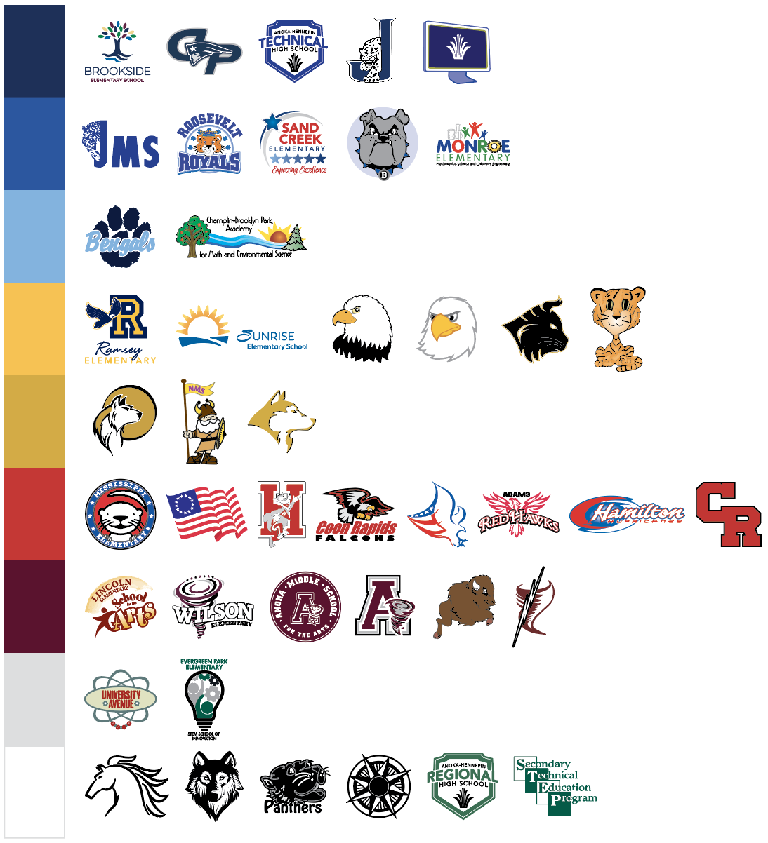
-
Elementary schools
Adams Elementary School

Download Adams Elementary School Logos
Andover Elementary School

Download Andover Elementary School Logos
Brookside Elementary School
Download Brookside Elementary School Logos
Champlin-Brooklyn Park Academy for Math and Environmental Science

Download Champlin-Brooklyn Park Academy for Math and Environmental Science Logos
Crooked Lake Elementary School
Download Crooked Lake Elementary School Logos
Dayton Elementary School
Download Dayton Elementary School Logos
Eisenhower Elementary School

Download Eisenhower Elementary School Logos
Evergreen Park Elementary: STEM School of Innovation

Download Evergreen Park Elementary: STEM School of Innovation Logos
Franklin Elementary School

Download Franklin Elementary School Logos
Hamilton Elementary School

Download Hamilton Elementary School Logos
Hoover Elementary School - Biomedical, Health Sciences, and Engineering
Download Hoover Elementary School - Biomedical, Health Sciences, and Engineering Logos
Jefferson Elementary School

Download Jefferson Elementary School Logos
Johnsville Elementary School

Download Johnsville Elementary School Logos
Lincoln Elementary School for the Arts
Download Lincoln Elementary School for the Arts Logos
Madison Elementary School

Download Madison Elementary School Logos
McKinley Elementary School
Download McKinley Elementary School Logos
Mississippi Elementary School
Download Mississippi Elementary School Logos
Monroe Elementary School - Mathematics, Science and Children's Engineering

Download Monroe Elementary School - Mathematics, Science and Children's Engineering Logos
Morris Bye Elementary School

Download Morris Bye Elementary School Logos
Oxbow Creek Elementary School
Download Oxbow Creek Elementary School Logos
Ramsey Elementary School
Download Ramsey Elementary School Logos
Rum River Elementary School

Download Rum River Elementary School Logos
Sand Creek Elementary School
Download Sand Creek Elementary School Logos
Sunrise Elementary School

Download Sunrise Elementary School Logos
University Avenue Elementary School - Aerospace, Children's Engineering and Science

Download University Avenue Elementary School - Aerospace, Children's Engineering and Science Logos
Wilson Elementary School
Download Wilson Elementary School Logos
-
Middle schools
Anoka Middle School for the Arts
Download Anoka Middle School for the Arts Logos
Coon Rapids Middle School

Download Coon Rapids Middle School Logos
Jackson Middle School - A Specialty School for Math and Science

Download Jackson Middle School - A Specialty School for Math and Science Logos
Northdale Middle School
Download Northdale Middle School Logos
Oak View Middle School

Download Oak View Middle School Logos
Roosevelt Middle School
-
High schools
Andover High School

Download Andover High School Logos
Anoka High School
Download Anoka High School Logos
Blaine High School

Download Blaine High School Logos
Champlin Park High School

Download Champlin Park High School Logos
Coon Rapids High School
Download Coon Rapids High School Logos
Anoka-Hennepin Regional High School
Download Anoka-Hennepin Regional High School Logos
Anoka-Hennepin Technical High School
Download Anoka-Hennepin Technical High School Logos
Secondary Technical Education Program (STEP)

-
Specialty Schools
Anoka-Hennepin Virtual Academy

Download Anoka-Hennepin Virtual Academy Logos
Compass Programs

Download Compass Programs Logos
River Trail Learning Center

-
Brand Examples
The human mind constantly searches for patterns in everything that it sees, striving to find the unified picture as a whole. If the mind cannot find pattern in what it’s seeking, it has a high tendency to look elsewhere. When creating design (whether it’s a website, brochure or ad), it’s important to design in such a way that makes it easier, not harder for the mind to see the pattern.
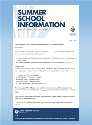
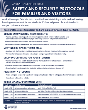
Consistency with logos, fonts, icons and symbols help potential customers relate all the different messages they’re seeing, and potentially what source they’re coming from.
Consistency with imagery is just as important. The phrase, “a picture is worth a thousand words” is used for a reason – pictures can help convey ideas and feelings that can support the messages you’re bringing across.
Every aspect of a organization’s print and electronic communications should be presented with a uniform appearance and that is why consistency in design is so important.
How can you use the many elements of our our brand identity system? Get creative! Here are just a few possibilities.
-
Thank you
If you have questions about anything in this brand guide or if you’re unsure if your communication materials best represent Anoka-Hennepin Schools, please email our communications coordinator at comm.pr@ahschools.us.

